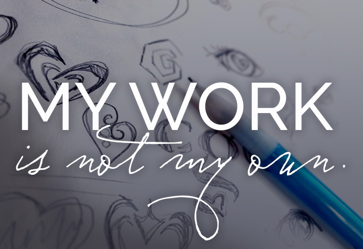
My Work is Not My Own
A peek into the design process
A big part of the design process is learning how to let go. We have to let go of those first few crummy ideas that pop in our heads so we can dig deeper. We have to let go of the way we are taught to see the world. To see the forms of letters we must see past the letters. We must let go of the assumption that elephants must be grey and that the sky must be blue. To let go of preconceived notions opens us to possibilities.
The same could be said for fine art, but my art is a very different kind of art; it isn’t my own. Ultimately, my art is the client’s. When you think of the Nike swoosh, do you think of Carolyn Davidson, the Portland State student who was paid a mere $35? No. You think of Nike. This makes the art of graphic design seem thankless. Perhaps it does feel this way sometimes, but I like to think of it another way, as a humble art, a serving art. It is not art for its own purpose but for someone else’s. It is not for my benefit but for the benefit of those for whom I create it.
This is something I need to remember as I create work to represent someone else. As much as I want to mold it to conform to my ideas, it was never meant to be for me.
My work is not my own
In that way, my work is not my own. That being said, when I am hired to design for a client, I don’t want to just give them what they ask for—I want to give them something better than what they even hoped for. This is where I ask my clients to join me in letting go by letting go of some of their own preconceived notions so that they might be open to an idea that didn’t even cross their mind.
This leaves room for what I like to call “design miracles”. Those are the moments when the stars align and I see something in a shape or form that inspires me to create what neither the client nor I even thought could happen. Granted, I always want to respect what the client has asked for. I own my own business, too, and want to respect that they know their own business, so I always show options based on original requests. But I also ask clients to be open-minded when I show something they didn’t expect. These unexpected options may not always be the answer, or the client may not want them.
That is something I need to respect and swallow. Sometimes I feel that the best solution was passed over, and that is a place where my clients and I will have to respectfully disagree. Should you ever be a client of mine and we do disagree, know that I may press a bit and lobby for what I feel is the best solution. (Cue the Jerry Maguire “Help me help you”). But ultimately I will respect your decision and point of view as I hope you respect mine. Know that any push back from me comes from my passion for the work and my desire to make you and your business look as great as you are.
The Reject Graveyard: Great logos that didn’t make the final cut
For us to land on the final logo there is quite the process that leads up to it (several hours of brainstorming, sketching, researching), usually resulting in my showing of 2-3 initial options. In honor of this topic, I wanted to show you a peek behind the curtain at the “Reject Graveyard”. Here are a few of those designs that were part of this process that didn’t make the final cut but I still love and wanted to share with you so you can see a little more of the process behind logo design.
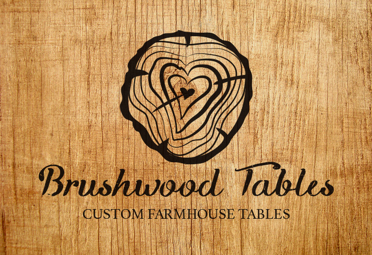
This logo was created for Brushwood Tables. Brushwood creates beautiful handcrafted tables that would make Pottery Barn jealous. What I wanted to capture in this logo option was the passion that is at the heart of what they do.
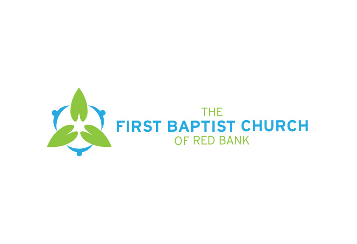
This logo was created and pitched to First Baptist Church of Red Bank, the church where I grew up. The inspiration for the design was to demonstrate their then new slogan of “Gather, Grow, & Go.” I symbolized this with the circle of people gathering together. Inside that circle are the three leaves that are both a nod to the Trinity as well as a symbol of growth. You will notice that those leaves reach beyond the circle to represent “going” or reaching out to the community or world around them.
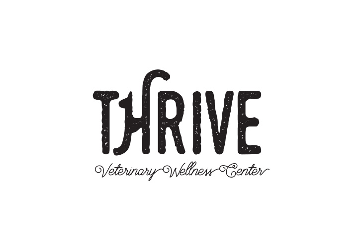 And finally, this logo was one of the options for Thrive Veterinary Wellness Center, who I just created a logo for. (Final logo decided upon and coming soon! Stay tuned!) We were all very excited about all the options and it was a difficult choice. This was one of the “rejects” that I thought was super fun. Do you see the cat? That’s one of those design miracles.
I hope you enjoyed a little peek behind the curtain!
Leave a Reply