Brand New Year, Brand New Brand

Everyone loves to make New Year’s resolutions to improve themselves. We look to shed those extra pounds we gained between Thanksgiving and the New Year (seriously, how is anyone supposed to control themselves around that much food?). We look to make amends, to organize, to decrease the clutter. We look at the New Year as a new chance to do it right. If we take this chance to better ourselves, why not consider trying to better our brands at the start of this New Year? How do you know if you’re in need of some brand resolutions? Consider these questions:
Is your brand a little out of shape?
Maybe your brand needs to hit the pavement and buff up again. Perhaps it has been a while since you’ve really looked at your brand. Does it still feel relevant? Was it really trendy 10 years ago and now it looks like it could use a refresh? Certainly consider that if something “ain’t broke, why fix it?” but sometimes brands don’t need to be broken to improve. Though the changes in the Twitter and Starbucks logos may seem small, they were changes that helped the brand to grow and evolve to visually match the sophistication that the brands had elevated themselves to. The change of the Logitech logo helped consumers smile rather then look with puzzlement at the boomerang and sun-like icon.
But don’t forget that branding is so much more than just logo design. You could have a strong logo but weak execution. It is so much more than plopping a logo on a page. Brands should have color palettes, stylistic elements, and other visual cues that properly convey the brand’s purpose, voice, and personality. Though the Coca-Cola logo and colors have hardly changed over the years (good example of “if it ain’t broke, why fix it?”) their application of the logo and other design elements, particularly on their can designs, has grown and changed and evolved with the years, keeping this classic brand ever-relevant.
Has your brand become cluttered?
Sometimes a brand can lose itself over time. While a brand may have begun on the right foot, sometimes in the busyness, a brand can lose its voice as it tries to be too many things all at once. Color palettes and brand element usage may become less tight and well-thought than it once was. Consistency may be lacking. A brand’s visuals should be like a fingerprint. It should be distinct, unique, and easily identifiable. If someone were to look at your email blasts, your print materials, your ads, and your website, would they think they all belonged to the same brand? Do they look like they have your brand’s fingerprints all over it?
It’s okay. We all get a little disorganized as time goes on. (You should have seen my linen closet last week. Oye!) Recognition is the first step to getting your brand back on track.
_________
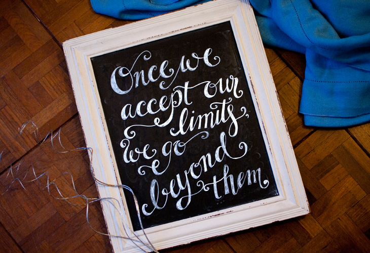
So take inspiration from the Albert Einstein quote, “Once we accept our limits, we go beyond them” and seek to find your brand’s limitations so that you can soar beyond them. Happy 2016!


Leave a Reply